Retail Store


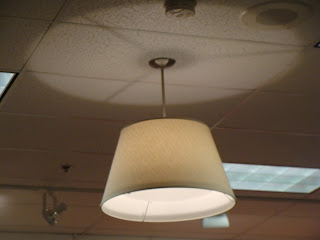
I was actually quite pleased with the overall lighting scheme of this retail store because when you walk in there is a warm feeling and a sense of sparkle that the accent lights seemed to portray. The lighting seemed to accentuate the clothing they were selling. A majority of the clothes contain warm colors, which are better showcased with warm lighting. Also the paint color of the walls and ceiling was off-white instead of a bright white.
I found that in retail stores the lighting is different than in restaurants and museums. The retail store that I choose to analyze was Maurices. This store is a retail distributor for teen and youth clothing, shoes, and accessories. The general lighting scheme consisted of both uniform fluorescent lights and yellow accent lights. The fluorescent lights in the store looked as if they already were existent before Maurices actually moved into the space. The mall probably placed the fluorescent lights in all of the retail spaces when it was built and then they expected the individual stores to contribute more to the lighting based on the retail design of the space. Also uniformly placed throughout were large dull yellow colored lights that seemed to distract from the fluorescent fixtures but were also a indirect source because most of the light was directed towards the ceiling. Accent lights were mainly used to accentuate posters and graphics displayed on the wall. These graphics were used for wayfinding purposes in locating different clothing items within the space. The accent lights appeared to be on a track system but were larger lamps than normally used. The bulbs looked as if they were similar to those of floodlights. They provided a great amount of light and almost to the point of too much. I would say that they did have some direct glare when your head was up. Most of the time this was the case because when working your way around the space and when examining cloths your head would be up.
I found it interesting that accent lights were used mainly on signage and graphics and not as much on highlighting new or popular attire. In this particular store the graphics were located above eye level so that the glare would not be too extreme so close to eye level. I think that some glare in this situation is appropriate because it created a sparkle that helped set an image and statement about the type of clothing they sold and the type of store they were. I would suggest that lighting be used more on highlighting the cloths and drawing attention to them in order to sell them better. I do think that having more of a yellow lighting scheme better suits the attire they are selling.
Thanks for taking the time to discuss this, I feel strongly that love and read more on this topic. If possible, such as gain knowledge, would you mind updating your blog with additional information? It is very useful for me. drivelineretail.com
ReplyDelete