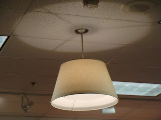
Jackson Library: UNCG: 4th floor
Week 4: September 28, 2009
approx. 1:00 p.m.
Observations of Space:
- this week has been a drastic change
- the shadows have shifted greatly and have no similarity to the two weeks before
- week one to week two was drastic, week two to week three had little changes and looked very similar, and week three to week four was once again drastic
- the shadows on the right side started dull and unclear and then changed to clear defined shadows
- by the last week the shadows were still very defined but had shifted greatly
- this space was now becoming more desirable
- shadows were almost back to the point that they were at on week one
- people were now sitting on the right side of the table in the middle of the space
- the week before the people were sitting on the opposite side
Sunday, October 11, 2009
Sketch Series 1
Jackson Library: UNCG: 4th floor
Week 3: September 21, 2009
approx. 1:00 p.m.
Observations of Space:
- very harsh shadows entering in on the right side instead of the left
- the shadow patternd appear very similar to the week before
- less daylight entering on the left
- the glare is too high and very uncomfortable when looking at the floor where the sun is hitting
- was one person sitting i the sun but not directly facing the sun
- had the person been sitting on the chair opposite the table then the sun would have directly been in their eyes and would have been absolutely unbearable
- the space was full of people today but everyone was trying to avoid the window letting all of the sun in
- the one person sitting there was forced to sit there because it was the only available seat
- this side of the space is too hot and too hard to look at
Sketch Series 2: Retail Store
Maurices
Retail Store
I was actually quite pleased with the overall lighting scheme of this retail store because when you walk in there is a warm feeling and a sense of sparkle that the accent lights seemed to portray. The lighting seemed to accentuate the clothing they were selling. A majority of the clothes contain warm colors, which are better showcased with warm lighting. Also the paint color of the walls and ceiling was off-white instead of a bright white.
I found that in retail stores the lighting is different than in restaurants and museums. The retail store that I choose to analyze was Maurices. This store is a retail distributor for teen and youth clothing, shoes, and accessories. The general lighting scheme consisted of both uniform fluorescent lights and yellow accent lights. The fluorescent lights in the store looked as if they already were existent before Maurices actually moved into the space. The mall probably placed the fluorescent lights in all of the retail spaces when it was built and then they expected the individual stores to contribute more to the lighting based on the retail design of the space. Also uniformly placed throughout were large dull yellow colored lights that seemed to distract from the fluorescent fixtures but were also a indirect source because most of the light was directed towards the ceiling. Accent lights were mainly used to accentuate posters and graphics displayed on the wall. These graphics were used for wayfinding purposes in locating different clothing items within the space. The accent lights appeared to be on a track system but were larger lamps than normally used. The bulbs looked as if they were similar to those of floodlights. They provided a great amount of light and almost to the point of too much. I would say that they did have some direct glare when your head was up. Most of the time this was the case because when working your way around the space and when examining cloths your head would be up.
I found it interesting that accent lights were used mainly on signage and graphics and not as much on highlighting new or popular attire. In this particular store the graphics were located above eye level so that the glare would not be too extreme so close to eye level. I think that some glare in this situation is appropriate because it created a sparkle that helped set an image and statement about the type of clothing they sold and the type of store they were. I would suggest that lighting be used more on highlighting the cloths and drawing attention to them in order to sell them better. I do think that having more of a yellow lighting scheme better suits the attire they are selling.
Saturday, September 19, 2009
Sketch Series 3
Fabric Swatch Observations
Space 1: Fluorescent
a. The purpose of Walmart is to serve people as a large chain retail and home goods store.
b. The lighting is ambient lighting that is uniform throughout the space. The purpose of the lighting is to provide lighting throughout the space evenly so that all spaces are accessible, all the products are properly lit, and that all people are able to move throughout the space properly.
c. The lamps are long fluorescent bulbs that are bright and have more of a blue color.
d. The luminaires are long fluorescent fixtures that are placed on a grid system which are also placed close together. There is not one single area throughout the space that is darker than any other.
e. The effect of the lighting source in the space is somewhat loud in both a literal and symbolic way. The lighting promotes high energy and alertness.
f. I feel that the illumination level is a little too high in that it is almost too bright. It has been reported that the illumination levels in stores like this have been raised so that quality of electronics change making more expensive items more appealing.
g. My suggestions would be to either lower the illumination level some or change the ambient lighting to include other forms, such as task and accent lighting. Maybe items would sell better if the lighting was non-uniform, making it more home-like and more imaginable of the customer’s typical living spaces.
Space 2: Halogen
a. The purpose of the space is a kitchen where light is needed under the cabinets to complete tasks.
b. Lighting is needed to use appliances and prepare food.
c. The luminance is a halogen bulb that is very small and unseen but puts off a lot of light.
d. The fixture sits directly under the cabinet and provides down lighting and depending on the quantity the amount of light would change. This source of the light is meant to not be seen.
e. The effect of the light in the space works very well when it is dark in the rest of the space and they are being used for accent lighting or during the day when other lights are on and they are used for completing kitchen tasks.
f. In this particular space the amount of illuminance is appropriate because it does not create a glare on the white counter tops but instead uses them to reflect light into the space. It has never appeared to be a problem.
g. I don’t think that any improvements need to be made on this lighting situation because they have never caused a problem. It depends on the wattage of bulb that we choose to put in the fixture.
Space 3: High-Intensity Discharge
a. The purpose of the space is a parking garage for a university.
b. The purpose of the lighting is to provide light to each of the dark levels of the garage because it is harder for daylight to creep into these spaces. The lighting appeared to be ambient and uniform through out.
c. The lamps appear to be high-intensity discharge lights that are extremely bright when in extreme proximity to them.
d. The fixtures themselves are small square luminaries that put off a large amount of light. The bulb itself is not exposed but with the cover a lot of light is still transmitted.
e. The effect of the light in the space is helpful in that is provides sufficient light to the entire parking deck. There did not appear to be any other areas that were more lit than others.
f. Because the bulbs are high-intensity the illuminance level is high because the bulbs have to work harder to light more area especially when it is dark and there is no other light assisting.
g. My suggestions for the lighting in this space would to have more fixtures because compared to other parking decks they appear to be better lit and have the feel to be safer. Just by observing during the day it did not seem that the number of fixtures would be enough.
Space 4: LED
a. Although not a space, the actual lamp source is a flashlight
b. The purpose of the fixture is a flashlight used in dark situations and space for providing light to function.
c. The lamp is a single LED bulb, approximately the size of the point of a pen that by itself can distract a great amount of light.
d. The luminaire provides direct lighting, allowing the light to only come out of one side. It is powered typically by batteries and is a handheld fixture.
e. The effect of the lighting source is a cone-shaped beam and or a small example of a spotlight. This particular flashlight is highly observed with the blue side of the spectrum.
f. The appropriateness of the lighting fixture is satisfactory but can be difficult when handling by your self. A luminaire this small can only put off so much light so large and detailed tasks are not as desirable with this source in mind.
g. I particularly like sources that are more yellow than blue. I find this LED overpowering and overwhelming. It is almost too blue. My suggestions would be to tone it down some and possible find a way to emit more light than is currently occurring. If this is not obtainable then possibly widen the cone shape beam to provide more light coverage at a closer distance.
Sketch Series 2: Restaurant
Ruby Tuesday
Ruby Tuesday has a lighting design that works well and creates a good mood while experiencing the space and eating a meal. All of the booths on the exterior of the space had a hanging light directly over the table creating down lighting. The shade of the fixture was in a cone shape and looking when up, the bulb of the fixture was exposed. These fixtures were set on a pretty dim setting so that they were not too harsh on the people sitting there. The tables in the middle of the space did not have a light directly over them but had larger lighting in between each of them. They were larger in diameter and they had a semi-opaque cover over them so that the bulb was not directly seen and that some of light was not transmitted through. Windows surround half of the dining space so during the day a good amount of day lighting is coming in. They have the amount controlled by the blinds and the angle at which they are turned. Other more hidden sources of light are provided but sit close to the ceiling and are directed towards objects displayed on the walls.
There appeared to be no noticeable glares yet the place was bright enough but not overly done. All of the lighting sources were either facing in the opposite direction of the view of people or they were dim enough that the placement of them did not really matter. I felt that this place was really thought out and I just had a good feeling while within it. I felt calm and relaxed and the low levels of the lights played a part in noise level of the restaurant. The lights were a warm yellow color instead of on the blue side of the spectrum. This worked well with the warm paint colors that were through out the space.
The lighting in the space in a way directed people through the space because it showed direct placement of the tables and showed people where the clear walkways were. The main dining area is divided down the middle with a wall that is closed on the bottom half but is open on the upper half. This wall is on the end were the windows were not so that the corners with the windows could throw light to its opposite corner through the open space where the wall was open.
Restaurant
Ruby Tuesday has a lighting design that works well and creates a good mood while experiencing the space and eating a meal. All of the booths on the exterior of the space had a hanging light directly over the table creating down lighting. The shade of the fixture was in a cone shape and looking when up, the bulb of the fixture was exposed. These fixtures were set on a pretty dim setting so that they were not too harsh on the people sitting there. The tables in the middle of the space did not have a light directly over them but had larger lighting in between each of them. They were larger in diameter and they had a semi-opaque cover over them so that the bulb was not directly seen and that some of light was not transmitted through. Windows surround half of the dining space so during the day a good amount of day lighting is coming in. They have the amount controlled by the blinds and the angle at which they are turned. Other more hidden sources of light are provided but sit close to the ceiling and are directed towards objects displayed on the walls.
There appeared to be no noticeable glares yet the place was bright enough but not overly done. All of the lighting sources were either facing in the opposite direction of the view of people or they were dim enough that the placement of them did not really matter. I felt that this place was really thought out and I just had a good feeling while within it. I felt calm and relaxed and the low levels of the lights played a part in noise level of the restaurant. The lights were a warm yellow color instead of on the blue side of the spectrum. This worked well with the warm paint colors that were through out the space.
The lighting in the space in a way directed people through the space because it showed direct placement of the tables and showed people where the clear walkways were. The main dining area is divided down the middle with a wall that is closed on the bottom half but is open on the upper half. This wall is on the end were the windows were not so that the corners with the windows could throw light to its opposite corner through the open space where the wall was open.
Monday, September 14, 2009
Sketch Series 1
Jackson Library: UNCG: 4th floor
Week 2: September 14, 2009
approx. 1:00 p.m.
[Observations of Space]
-more light appears to be coming in on the right side instead of entering at equal amounts on both sides
-the shadows on the right side are more harsh and defined
-the shadows on the left are softer and seem to fade into the color of the floor
-it is way too hot to sit on the right side (which is where my viewpoint is)
-creates too much of a glare on my paper
-very uncomfortable
-explains why no one was sitting here already
-the area around the windows is way too bright so my eyes had to adjust to looking at the other side of room which is darker because there is no daylight
-approximately two people were sitting on the side with the windows and five people sitting on the side with only electric lights
-after thirty minutes the sun had moved behind my viewpoint and cooled down the space some
Tuesday, September 8, 2009
Sketch Series 2: Art Gallery
Elliot University Center
Art Gallery
Art Gallery
Here when looking at the darker corner of the space the light is way too
bright to even look in that direction.
The small art gallery in the Elliot University Center is a good example of how light has been used in a good and bad way. Providing the most light to the space appears to be halogen floodlights that serve the purpose of highlighting the work that’s on display. Although it does a good job of doing this it also causes a strong glare problem that was not addressed. A supplementary lighting source is the fluorescent light bulbs in the ceiling fixtures. There is one of these located as you first walk in and another one place in the corner where the room changes direction.
The problem with the halogen lights is the direction in which they are giving off light. They are pointed to face the opposite wall than what one would think. I understand why one would think this would work because it changes the distance of the lighting source, which in turn provides light to more space. I think by having them the way they are now prevents them from creating glares on the walls. The walls appear to be a white matte paint finish, somewhat textured. If the lights were to be turned around I think they would be too close to the wall and at that point create unnecessary glares on the walls preventing the artwork from being enjoyed. The problem that is present with this overall lighting design is that the halogen lights, although they provide sufficient light to the artwork, they do not allow the users to enjoy the space the best they could. I found myself squinting to work my way around the space. Everywhere you looked there was some kind of light that was blinding you. I find this a real big problem.
While I was there observing the space there were no other viewers. Naturally I started moving through the space by starting on the right and working my way around the perimeter. This most likely would be the way that people inhabit the space because there is one entrance so you enter, observe the art while working your way around the perimeter, and then exit the same door in which you entered. So based on this situation the lighting needs to be in favor of this. The lights don’t need to be facing the viewers at any point while they are enjoying the space because this could cause them to have a bad experience.
Subscribe to:
Posts (Atom)